●設計服務:計畫申請 / 品牌Logo產品包裝 / 產品拍照
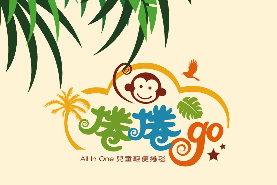
捲捲Go
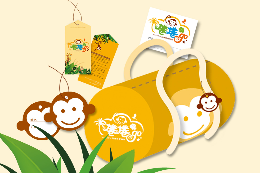
「捲捲Go」的品牌視覺設計主視覺冒險叢林元素與俏皮的猴子角色,搭配明亮飽和的色彩(如綠、橘、藍),營造出熱帶探險的氛圍,呼應品牌訴求的「All In One 兒童輕便捲毯」概念。Logo 中的「捲捲」字體以手寫感的筆觸呈現,增添童趣與親和力,而「go」的螺旋造型則巧妙呼應產品可捲式設計,具象化產品功能。
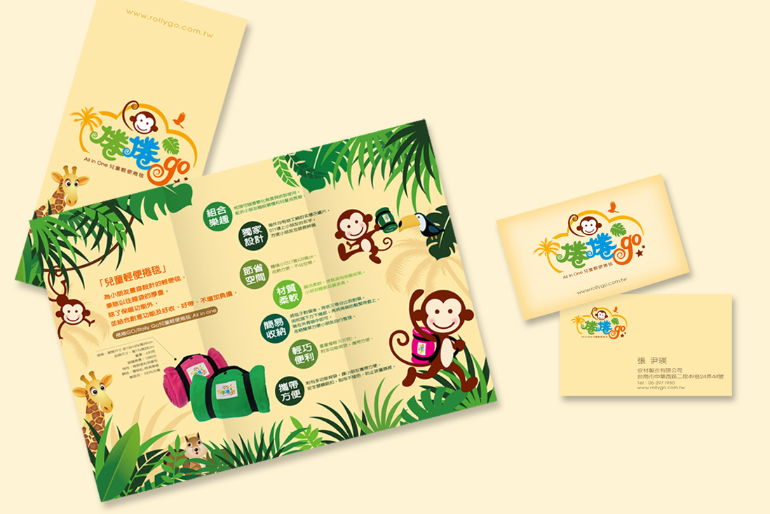
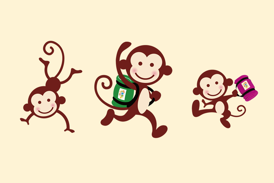
品牌角色「猴子」設計簡潔有力,表情友善、姿態靈動,應用於各式物件如吊牌、名片、提袋等,強化品牌辨識度與記憶點。此設計不僅吸引兒童目光,也讓家長感受到產品的實用性與趣味性,是一套兼顧功能與視覺吸引力的兒童品牌識別設計。
The brand visual design of “捲捲Go” centers around a jungle adventure theme, featuring a playful monkey character and vibrant, saturated colors such as green, orange, and blue. This creates a tropical exploration atmosphere that aligns with the brand’s concept of an “All In One” lightweight children’s roll-up blanket. The logo’s “捲捲” typography uses a hand-drawn style to add a sense of childlike fun and friendliness, while the spiral shape of “go” cleverly reflects the product’s rollable function, visually representing its practicality.
The monkey mascot is designed with simplicity and charm—friendly in expression and dynamic in posture—appearing across various brand materials such as tags, business cards, and carry bags, which enhances brand recognition and memorability. This design approach not only captures the attention of children but also appeals to parents by highlighting the product’s functionality and playful character. Overall, it is a well-rounded children’s brand identity that balances utility with visual appeal.


