


● 設計服務:農會品牌視覺規劃/吉祥物設計/服裝設計製作/產品包裝設計/行銷團隊(知識科技/網站購物/LINE商店/行銷專案)
柳營農會_品牌設計整合
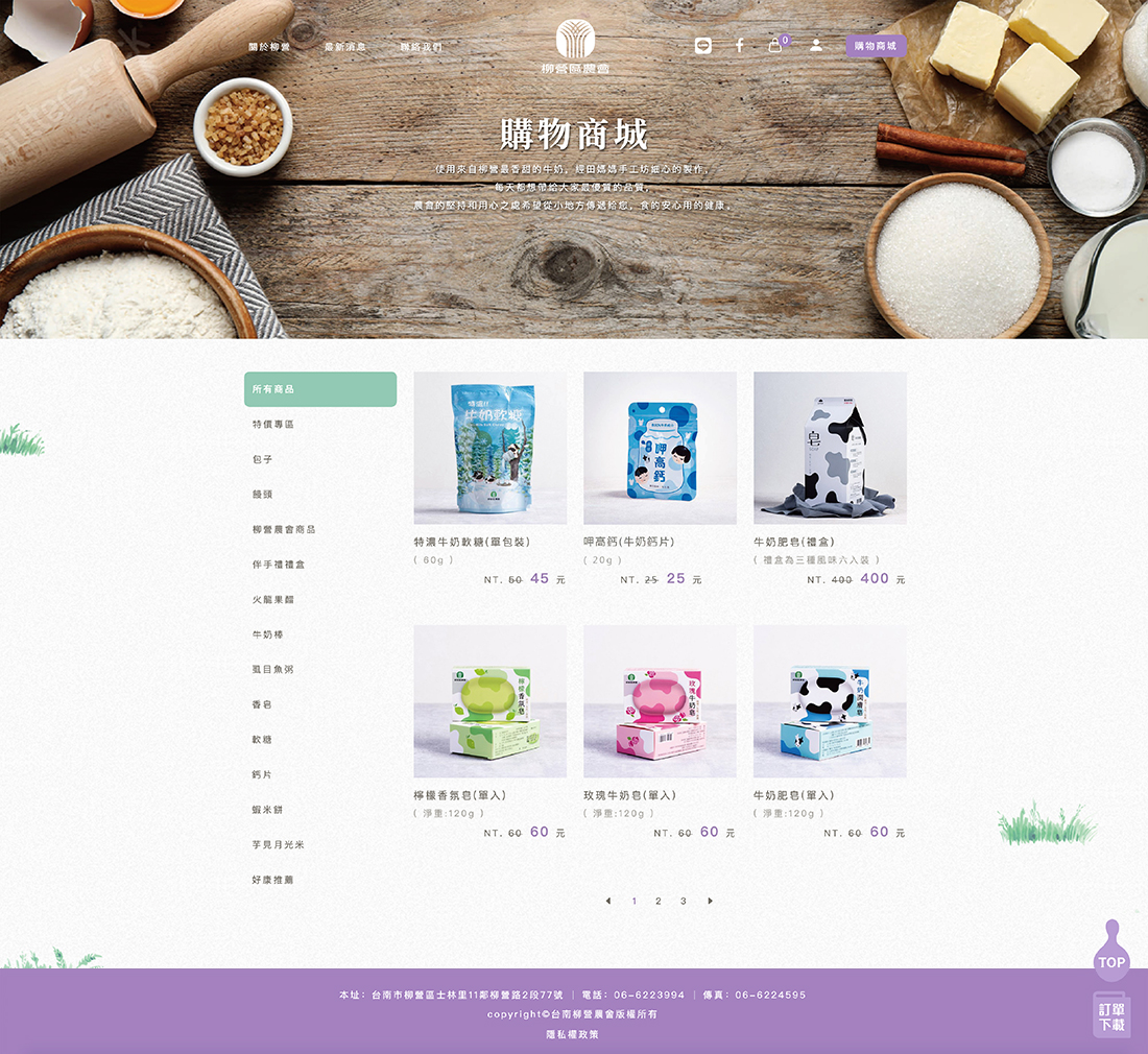
臺灣農會總計約301間,農會下轄的產品琳瑯滿目,品牌眾多且雜亂,幾乎沒有一間農會將商品放一起是協調統一且美觀的。本案在於解決柳營農會面臨的同樣問題。
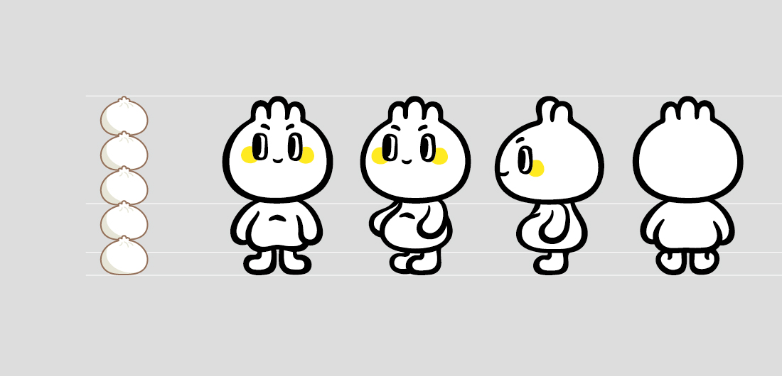
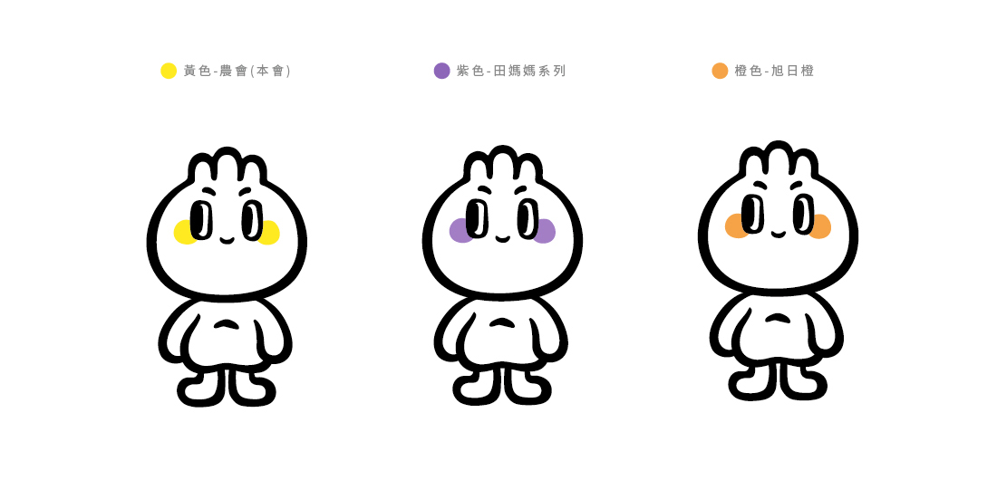
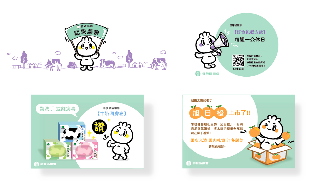
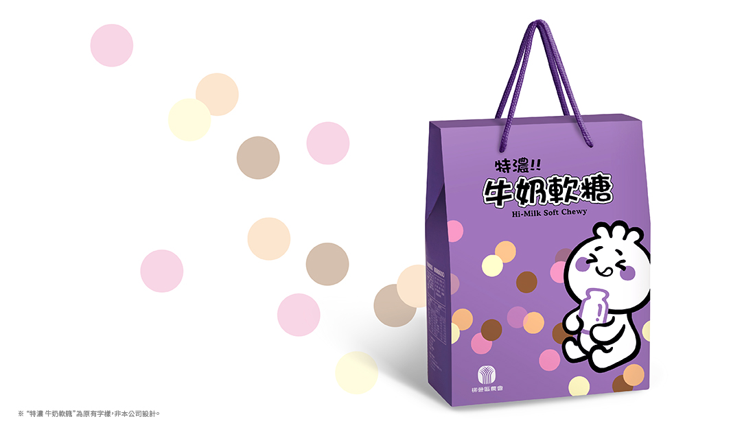
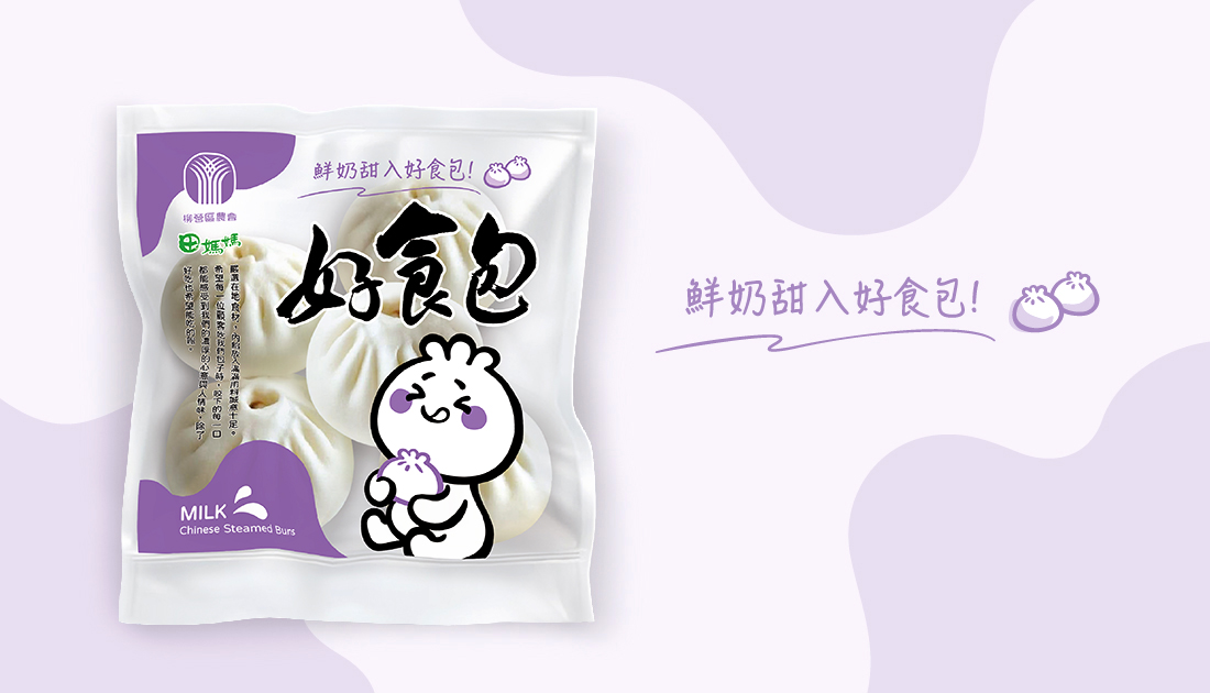
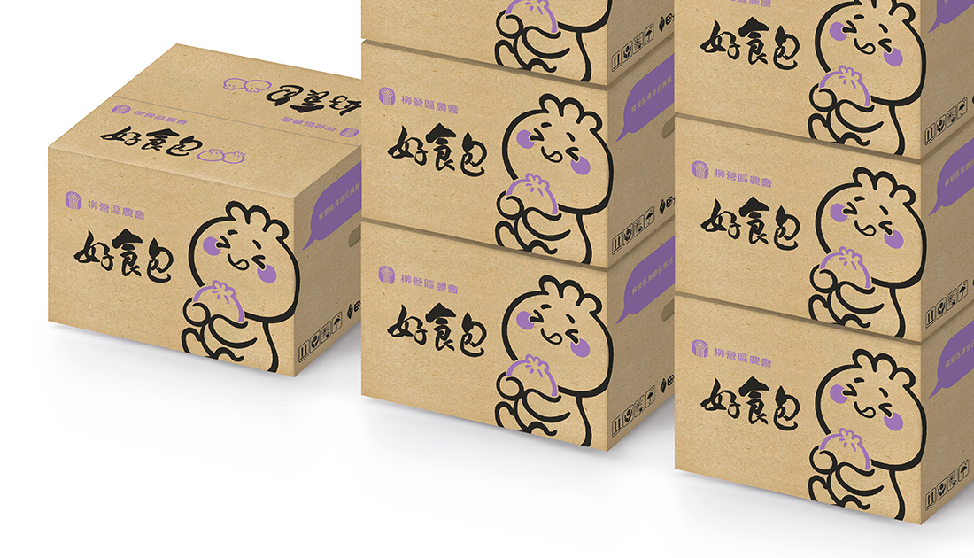
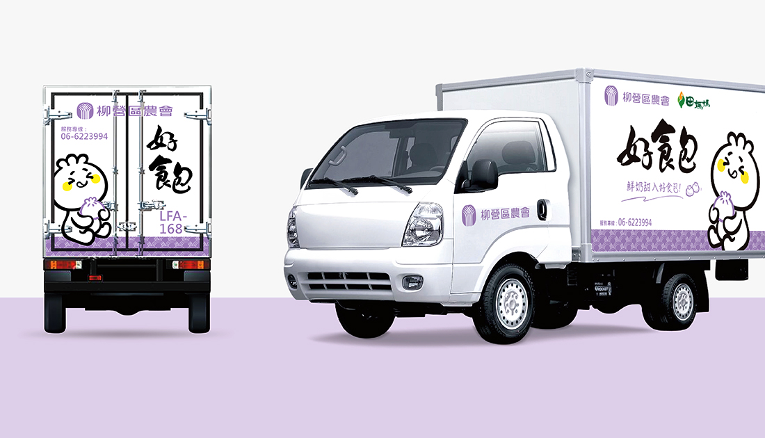
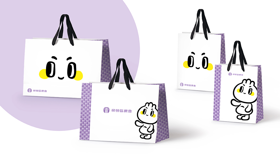
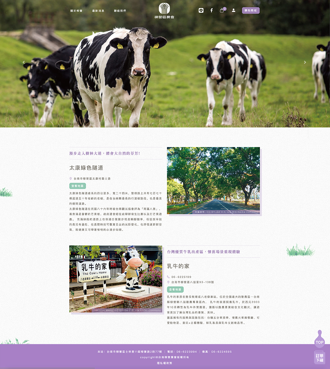
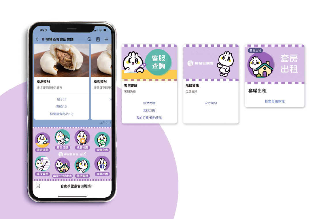
柳營區農會特色非常鮮明,是全台灣最大的牛乳產地;所以成就許多相關鮮奶製品,但也因此淡化其他特色農產品。為保有原酪農特色以及其他農產品的彰顯,捨棄牛隻形象採以種籽及包子雙重意象的吉祥物,輔以特別定義的標準粉紫色,來形塑柳營區農會給消費者的品牌記憶,解決臺灣農會在統一品牌視覺下無法呈現區域農會品牌印象的窘境。
There are about 301 Farmers’Associations in Taiwan. The products are dazzling, abut the brands are numerous and messy. No one can put these products together consistency、systematically and beautifully. This case is to solve the same problemsfaced by the Liu Ying District Farmer’s Association.
The Farmers’ Association in Liu Ying District has distinct characteristics and is the largest milk-producing area in Taiwan. As a result, many related fresh dairy products have been famous, but other special agricultural products have also been not seen.
In order to maintain the characteristics of the original dairy farmers and the connection with other agricultural products, the mascot of the double image of seeds and buns is used for abandoning the image of cows.
Supplemented with a specially defined standard purple, the brand memory of Liu Ying District Farmers’ Association will be created. Solve the predicament that the Taiwan Farmers Association cannot present the brand image of the Regional Farmers’ Association with a unified brand.


