
●設計服務:VI視覺系統手冊 / 產品輔助圖案 / 展場設計規劃 / 包裝印刷 / 植牙體輔銷品
鴻君科技股份有限公司 TIONE
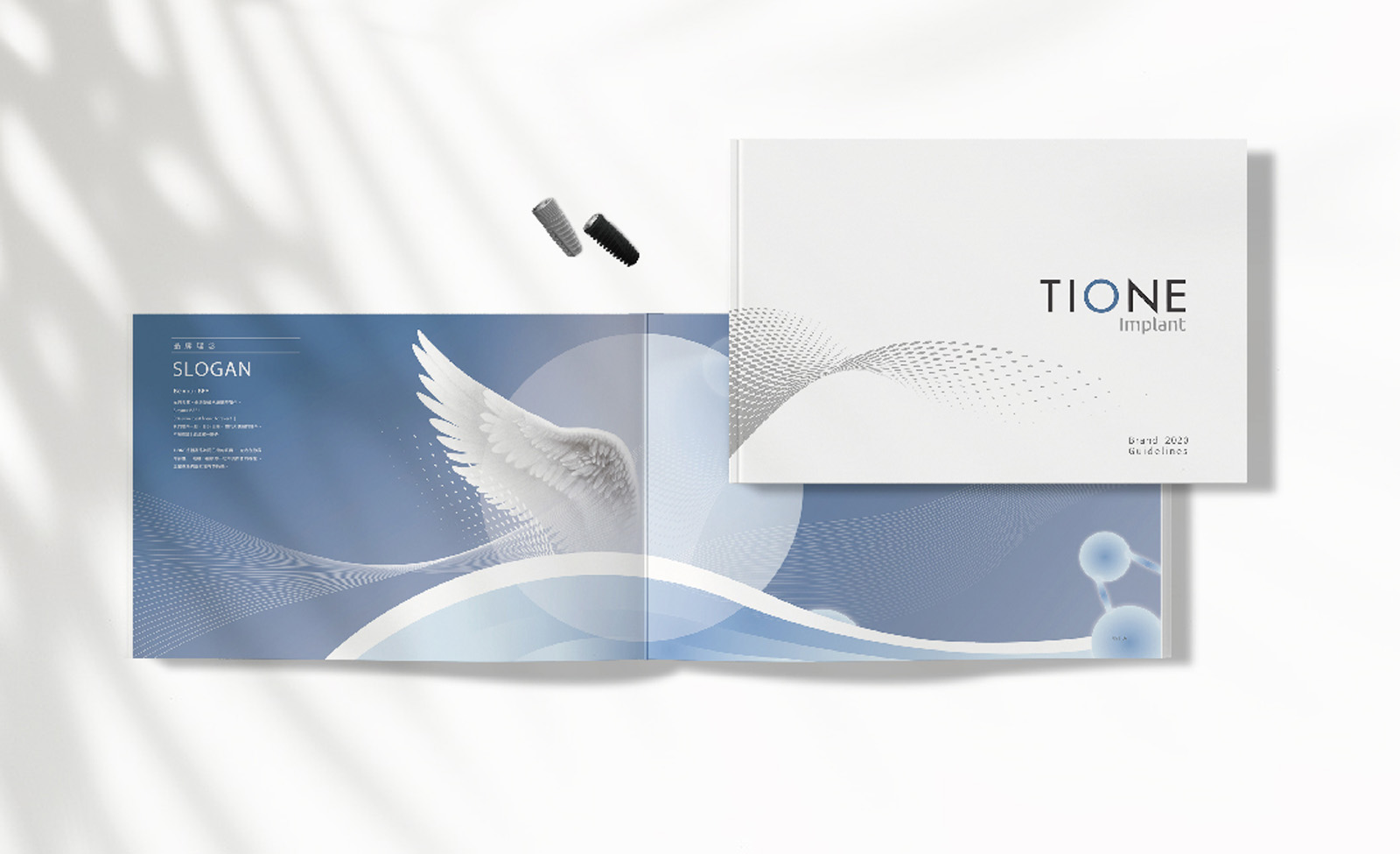
本次設計服務旨在於不更動原有商標圖騰的前提下,延伸開發具品牌識別性的輔助圖像系統。透過整合產品分類與識別架構,提升產品包裝的整體獨特性與視覺一致性,最終彙整所有設計成果,編製為企業識別系統手冊(VI Manual),協助品牌未來可持續、自主地進行延伸與應用。
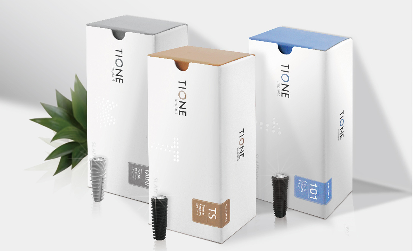
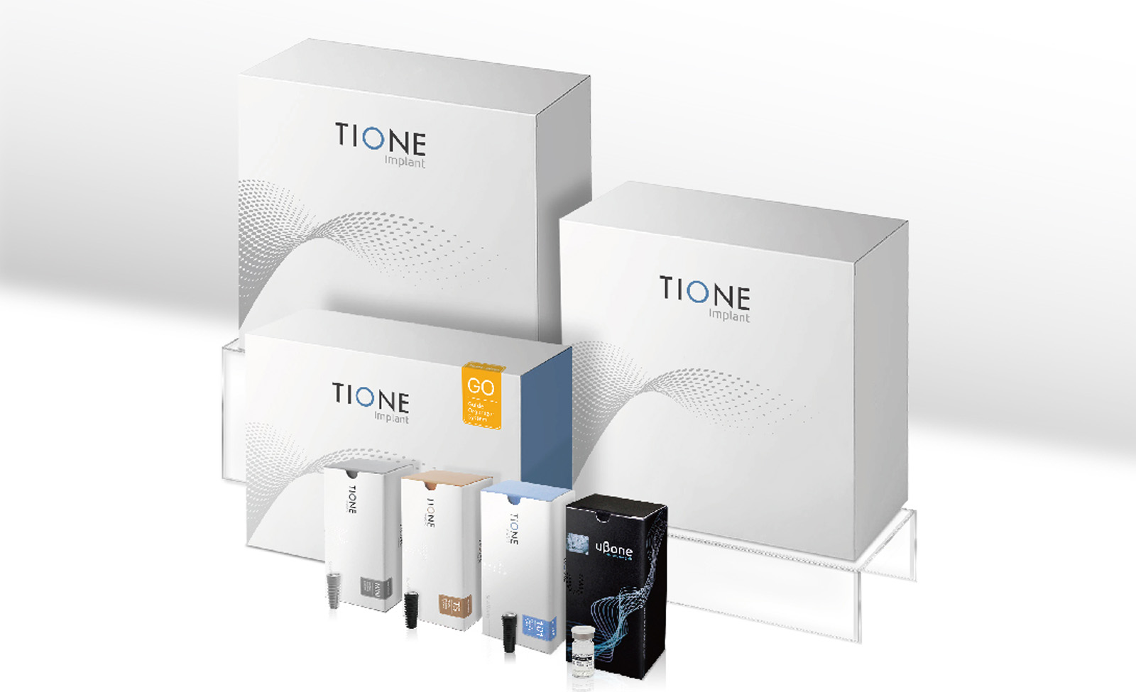
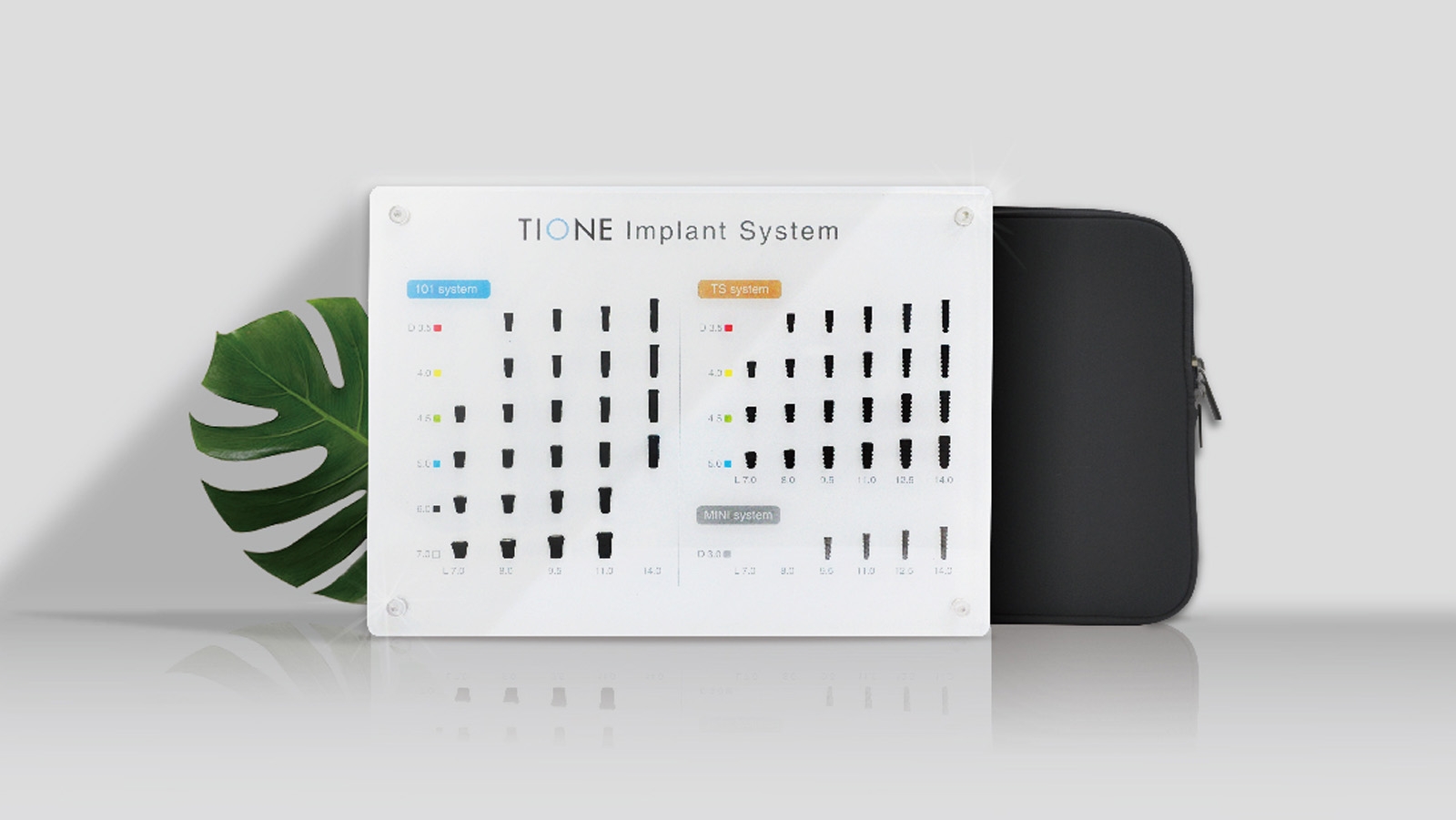
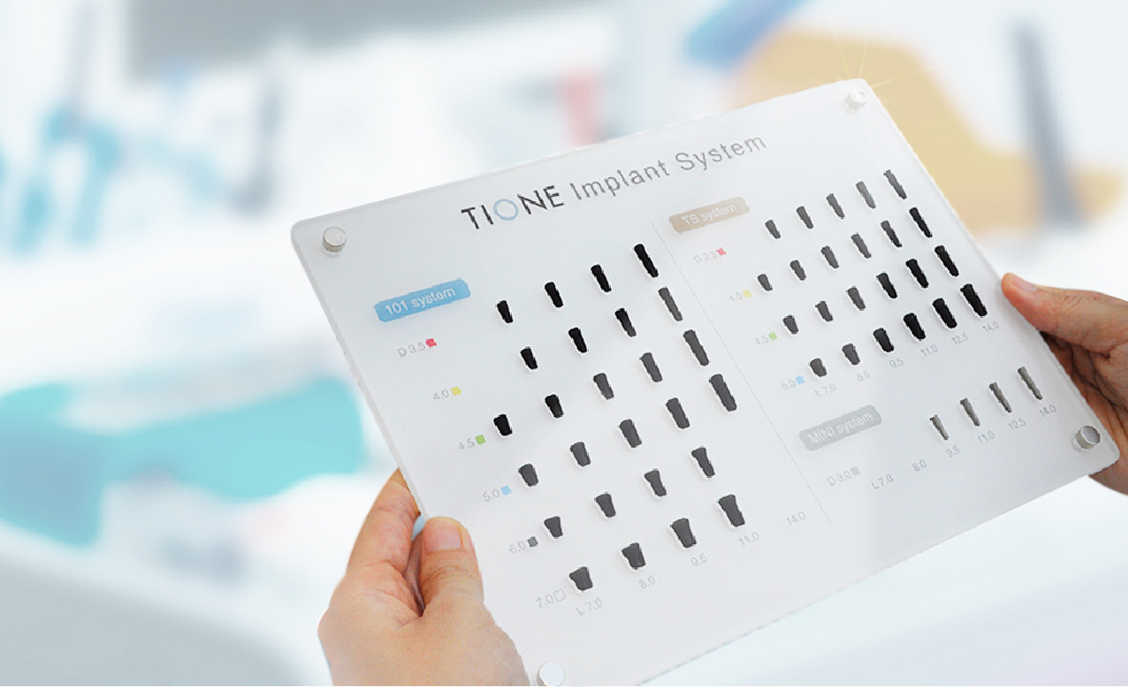
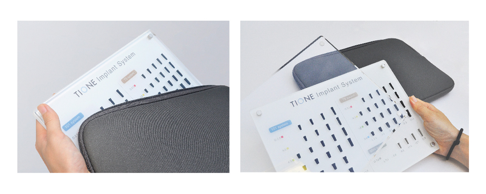
在銷售輔助品的設計方面,針對多年來因製程限制無法量產的壓克力展示樣品,提出可行解決方案,協助TIONE順利完成一定數量的植體展示產品,強化業務端的銷售工具。
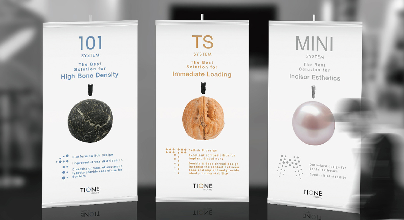
展覽海報設計則以植體產品的核心特性為設計發想,針對適應不同牙床軟硬度的功能,透過圓形意象對應牙齒結構與硬度,直觀傳達產品在臨床應用中的實際效能與優勢,進一步強化專業形象與產品認知。
This design project centers on the creation of a distinctive set of auxiliary graphics that enhance brand recognition while preserving the integrity of the original logo emblem. By aligning product categorization with a coherent visual identification system, the packaging design achieves greater uniqueness and consistency across the product line. All design elements are consolidated into a comprehensive Visual Identity (VI) Manual, equipping the brand with a scalable framework for future expansion and implementation.
To support sales efforts, we developed a practical solution to overcome long-standing manufacturing challenges related to acrylic-based implant display samples. This allowed TIONE to successfully produce a consistent quantity of promotional tools that effectively aid the sales team in presenting the implant products.
For the exhibition poster design, we drew inspiration from the core functionality of the implant system—specifically its adaptability to varying gum densities. Circular graphic elements were used to symbolically reflect the hardness levels of natural teeth, providing a visually intuitive representation of the product’s clinical advantages and reinforcing its professional appeal.


