●設計服務:品牌Logo / 事務用品 / 產品包裝 / 產品拍照 / OEM包裝 / 企業形象網站
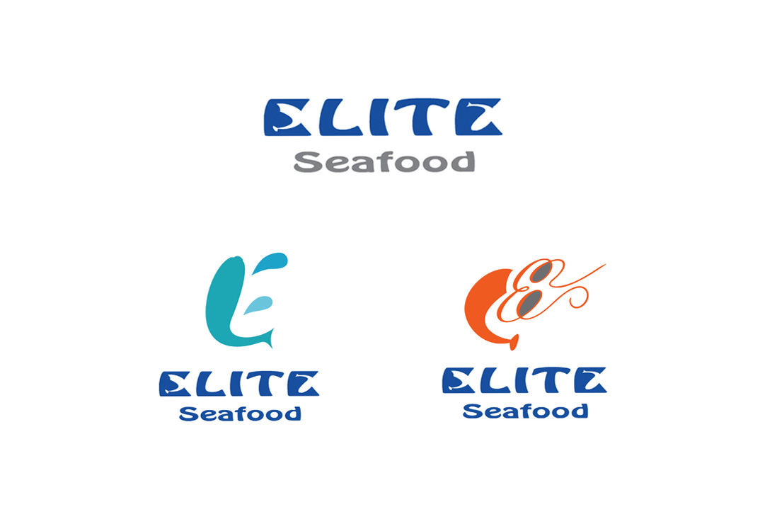
Eliteseafood
以「Elite」結合「Seafood」作為品牌名稱,傳達高品質與專業水產的形象,並透過現代感十足的字體設計及二款產品線Logo,展現品牌靈活性與延展性。整體視覺以藍色系為主,呼應海洋意象,搭配卡通化的蝦與魚圖騰,營造出親切又不失專業的氛圍,有效貼近大眾市場與消費者情感。
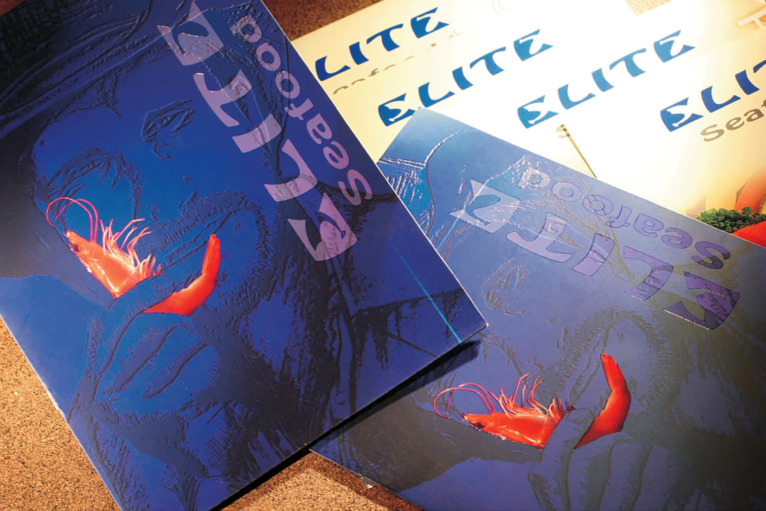
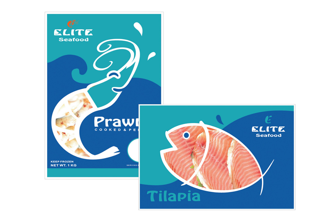
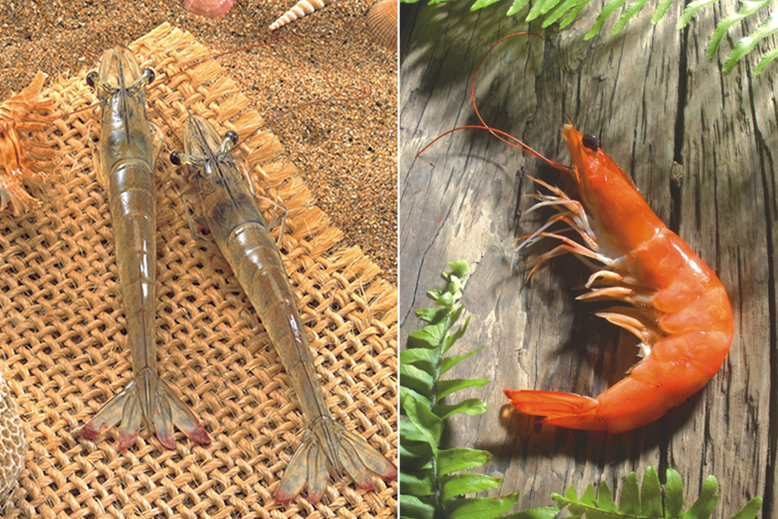
在包裝與應用設計方面,插畫風格的產品視覺簡潔清楚,線條流暢且色彩活潑,不僅提高了辨識度,也讓品牌形象更具溫度。實體印刷同樣以有趣的插畫結合蝦體實物,延伸活潑有趣並提升整體品牌專業度。整體而言,這套設計成功地融合企業專業與消費親和力,為 Eliteseafood 建立了具辨識度、易於溝通且具市場競爭力的品牌形象。
By combining “Elite” and “Seafood” as its brand name, Eliteseafood conveys a high-quality and professional image within the seafood industry. The use of sleek, modern typography, along with two distinct product line logos, highlights the brand’s flexibility and visual adaptability. With a blue color palette that evokes the ocean, the overall identity is further enriched by cartoon-style shrimp and fish emblems, striking a balance between friendliness and professionalism that resonates with mass-market consumers.
In terms of packaging and applications, the illustration-driven visual style is clean, vibrant, and fluid, featuring smooth lines and lively colors that boost brand recognition and infuse a sense of warmth. Physical print materials also combine playful illustrations with actual shrimp imagery, extending the brand’s cheerful personality while reinforcing its professional credibility.


